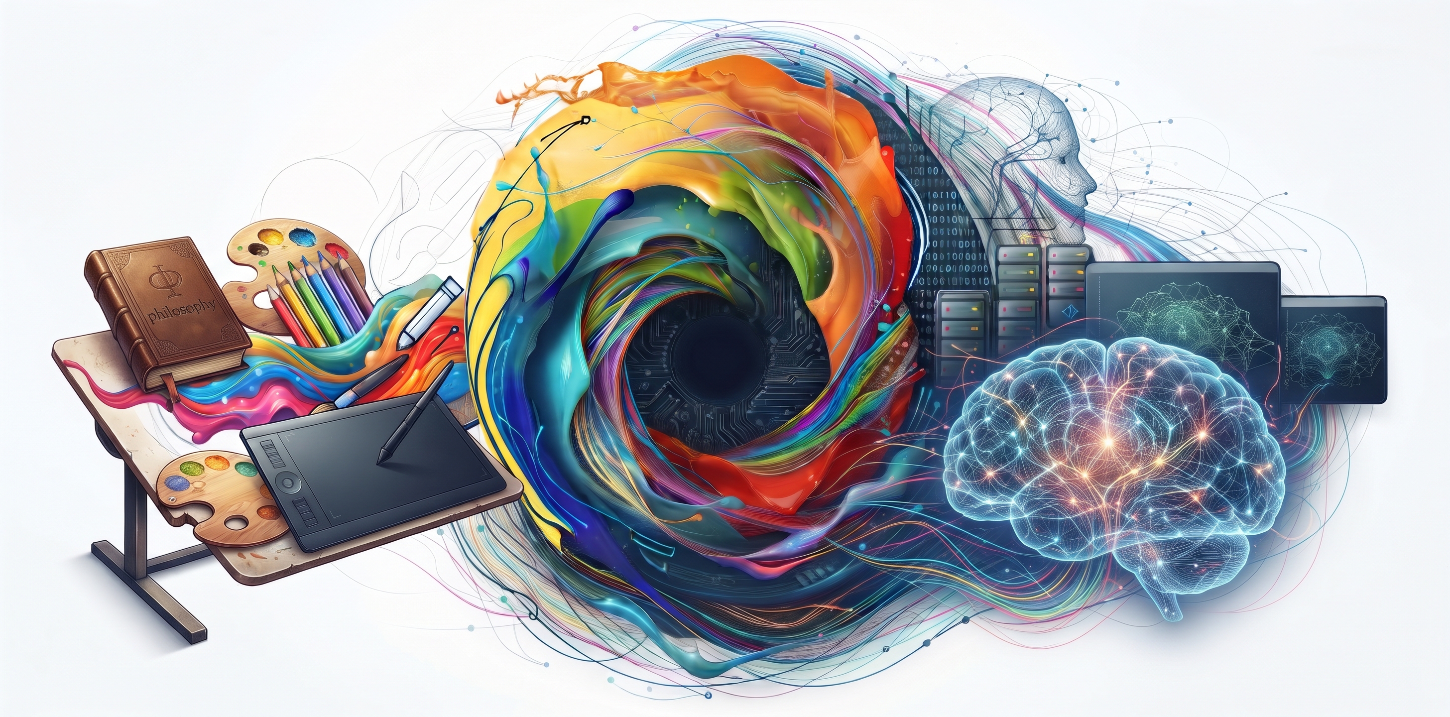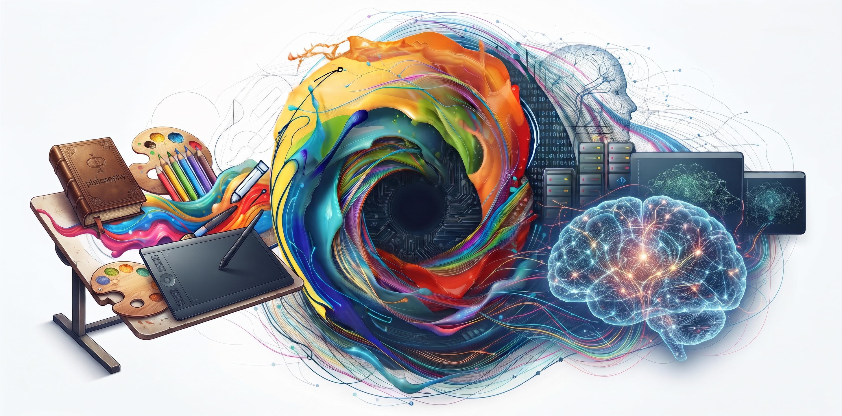
Color in branding is far more than an aesthetic preference. It is a silent language, a psychological trigger, and an authoritative strategic tool that encodes brand values and builds instant emotional connections in consumer consciousness.
1. The Psychology of Color & Consumer Perception
Consumer research shows that up to 85% of purchasing decisions are subliminally influenced by color. Different spectral frequencies trigger distinct psychological responses:
- Navy & Corporate Blue: Conveys dependability, security, and enterprise strength; standard in finance, healthcare, and SaaS.
- Vibrant Red & Orange: Radiates urgency, bold energy, and appetite stimulation; favored in entertainment and lifestyle brands.
- Emerald Green: Synonymous with vitality, ecological mindfulness, and economic prosperity.
- Deep Black & Warm Gold: Embodies prestige, exclusivity, and understated luxury.
2. Harmonious Palettes & The 60-30-10 Rule
A balanced brand palette requires mathematical discipline:
- 60% Dominant Tone: Sets the overall atmospheric canvas across brand touchpoints.
- 30% Secondary Shade: Provides structural contrast for headers, cards, and secondary UI layouts.
- 10% Accent Catalyst: High-energy pop tone designed exclusively to draw immediate focus to conversion points and CTAs.
The Ewebbers Studio Philosophy
At Ewebbers Studio, we treat brand identity as an enduring intellectual asset. We fuse market intelligence with rigorous chromatic science to design visual systems that stand the test of time and dominate competitive landscapes.